Creating effective landing pages is crucial for successful online marketing. By understanding their purpose, setting clear goals, and implementing best practices, you can design landing pages that engage visitors and drive conversions.
Are you struggling to convert visitors into customers on your website? It might be time to take a closer look at your landing pages.
Landing pages play a crucial role in capturing leads, driving sales, and achieving your business goals. In this blog post, we will explore the best practices for creating effective landing pages that not only attract visitors but also compel them to take the desired action.
Before diving into the best practices, it's essential to understand what landing pages are. A landing page is a standalone web page designed with a specific purpose in mind, usually to capture visitor information or drive them toward a particular action.
They are distinct from other pages on your website, such as the homepage or product pages, as they are specifically designed for conversion.
Here are the best practices to achieve landing pages that attract more customers and amplify their signals of interest.
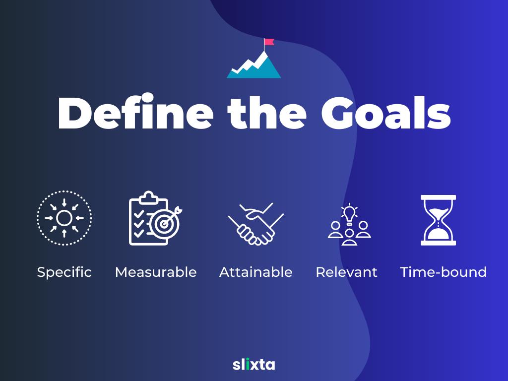
Defining Your Goal
Before creating a landing page, it's crucial to define your goal. What action do you want visitors to take? Are you aiming to collect email addresses, promote a product or service, or encourage visitors to register for an event?
Clearly identifying your objective allows you to tailor your landing page to that specific goal and optimize it for maximum conversions.

When defining your goal, consider the desired outcome and the metrics you will use to measure success. Setting SMART (Specific, Measurable, Attainable, Relevant, Time-bound) goals provides clarity and enables you to track the effectiveness of your landing page over time.
With a well-defined goal, you can craft a landing page that motivates visitors to take action and drives tangible results for your business.
Crafting an Attention-Grabbing Headline
The headline is the first element visitors see when they land on your page, and it plays a crucial role in capturing their attention. A compelling headline should be concise, clear, and communicate the unique value proposition or benefit visitors will receive by engaging with your offer. It should instantly convey the purpose of your landing page and pique visitors' interest to encourage them to continue reading.
To create an attention-grabbing headline, consider using power words that evoke emotions or trigger curiosity. Pose a thought-provoking question that resonates with your target audience or present a solution to a common problem they may be facing. By focusing on the visitor's needs and presenting a compelling reason to stay on the page, you can increase the chances of visitors engaging further with your content.
Additionally, using subheadings throughout your landing page can further break down the information and guide visitors through the key points. These subheadings should be clear, concise, and aligned with the overall messaging of your headline, helping visitors understand the value your offer provides.
Designing an Engaging Layout
The layout of your landing page plays a vital role in capturing and retaining visitors' attention. An engaging layout should be visually appealing, consistent with your brand's aesthetics, and create a seamless user experience. It should guide visitors' eyes to the most important elements on the page, such as the headline, call-to-action button, and key benefits.

Whitespace is a crucial design element that allows content to breathe and provides visual clarity. Use whitespace effectively to separate sections, highlight key information, and create a sense of balance on the page. A clutter-free and organized layout ensures that visitors can quickly grasp the main message of your landing page and navigate through the content effortlessly.
In addition to whitespace, the strategic use of colors, fonts, and imagery can significantly enhance the visual appeal of your landing page. Choose colors that align with your brand identity and evoke the desired emotions in your audience. Select fonts that are legible and complement your overall design. Including relevant and high-quality images or videos can also help communicate your message more effectively and engage visitors on a deeper level.
Writing Compelling Copy
The copy on your landing page is crucial for conveying your message and persuading visitors to take action. It should be concise, compelling, and focused on addressing the needs and desires of your target audience. Craft persuasive copy that clearly communicates the value and benefits of your offering.
Use bullet points, short paragraphs, and subheadings to enhance readability and break down information into digestible chunks. Highlight the key features and advantages of your product or service, addressing pain points and emphasizing how your offer solves their problems. By aligning your copy with the visitor's needs and presenting a compelling value proposition, you can effectively drive conversions.
Remember to create a sense of urgency and emphasize the value of taking immediate action. Limited-time offers, exclusive discounts, or the promise of instant gratification can encourage visitors to act quickly. By crafting persuasive copy that resonates with your target audience, you can increase the likelihood of conversion on your landing page.
Optimizing Call-to-Action Buttons
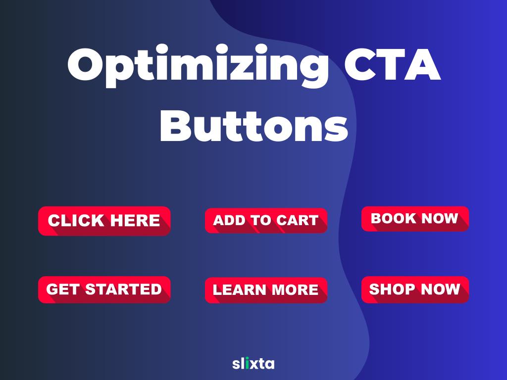
The call-to-action (CTA) button is a critical element of your landing page. It serves as a gateway for visitors to take the desired action. Optimizing your CTA button is essential for increasing conversion rates.
Make your CTA button stand out by using contrasting colors that grab attention. Choose action-oriented language that compels visitors to act, such as "Get Started," "Download Now," or "Claim Your Free Trial." Ensure that the button is easily visible and located in a prominent position on the page. Experiment with different button sizes, shapes, and text to find the combination that resonates best with your audience.

Consider using persuasive copy near the CTA button to reinforce the value and benefits of taking action. For example, you could include a brief sentence or phrase that reinforces the value proposition and encourages visitors to click the button. By optimizing your CTA button, you can significantly impact the conversion rate of your landing page.
Incorporating Social Proof
Social proof is a powerful tool for building trust and credibility. By incorporating testimonials, reviews, case studies, or client logos on your landing page, you can demonstrate that others have had positive experiences with your product or service.
Genuine testimonials from satisfied customers can be highly influential in persuading visitors to take action. Include testimonials that highlight specific benefits or results achieved, showcasing real-life examples of how your offering has helped others. Make sure the testimonials are authentic and include the customer's name, photo, and any relevant details that add credibility.
In addition to testimonials, displaying client logos can also instill trust in your brand. If you have worked with reputable companies or influential individuals, showcasing their logos can help establish credibility and foster confidence in your offering.
Remember to regularly update and refresh the social proof elements on your landing page to maintain relevancy. By incorporating social proof, you can alleviate any doubts or reservations visitors may have and increase their confidence in converting.
Creating Trust with Testimonials
Testimonials are an effective way to build trust and credibility with your audience. Include testimonials from satisfied customers on your landing page to showcase positive experiences and results.

Here are some best practices for using testimonials effectively:
- Use real names and photos: Authenticity is key when it comes to testimonials. Include the customer's full name and a photo, if possible, to add credibility and make the testimonials more relatable.
- Highlight specific results: Encourage customers to share specific outcomes or benefits they experienced as a result of using your product or service. This helps potential customers envision the value they can derive from it.
- Showcase diversity: Include testimonials from different types of customers to demonstrate the broad appeal and effectiveness of your offering. This can include customers from various industries, demographics, or geographic locations.
- Incorporate video testimonials: Video testimonials are particularly powerful as they allow potential customers to see and hear real people sharing their positive experiences. Videos can evoke emotions and build trust more effectively than written testimonials alone.
Implementing A/B Testing
A/B testing, also known as split testing, is a vital practice for optimizing your landing page's performance. By creating two or more versions of your landing page and testing them against each other, you can identify which elements, such as headlines, copy, or CTAs, have a higher impact on conversion rates.
Here are some key points to consider:
- Test one element at a time: To accurately measure the impact of specific changes, test only one element at a time. For example, if you're testing headlines, keep all other elements consistent across the variations.
- Set clear goals and metrics: Determine what success looks like for each test. Are you aiming for higher click-through rates, longer time on page, or increased form completions? Define the key metrics you'll be tracking to evaluate the performance of each variation.
- Use a reliable testing tool: There are various A/B testing tools available that make it easy to create and analyze different versions of your landing page. Choose a tool that suits your needs and provides accurate data and insights.
- Run tests for an adequate duration: Ensure that you run your tests for a long enough period to gather statistically significant data. Rushing the testing process may lead to inaccurate conclusions and ineffective optimizations.
Mobile Optimization
With the increasing use of mobile devices, it's crucial to optimize your landing page for mobile users. Mobile optimization ensures that your landing page looks and functions seamlessly on smaller screens, providing a positive user experience regardless of the device being used.
Consider the following practices:
- Responsive design: Ensure that your landing page is built with a responsive design that automatically adapts to different screen sizes and resolutions. This will provide a seamless experience for mobile users and improve engagement.
- Simplify navigation: Mobile users have limited screen space, so it's important to simplify your navigation menu. Use collapsible menus or hamburger icons to save space and make it easier for users to find what they're looking for.
- Streamline forms: Mobile users are less likely to fill out lengthy forms. Optimize your forms for mobile by keeping them short and only asking for essential information. Utilize autofill and smart input features to minimize typing effort.
- Optimize loading speed: Mobile users have less patience for slow-loading pages. Optimize your landing page by compressing images, minifying code, and leveraging caching techniques to ensure fast load times.
Optimizing Loading Speed
Page loading speed is a critical factor that can significantly impact user experience and conversion rates. Slow-loading pages can lead to high bounce rates and lost opportunities.
Consider the following tips to optimize your landing page's loading speed:
- Compress images: Large images can significantly slow down your page. Compress images without compromising quality to reduce their file sizes and improve loading times.
- Minify code: Remove unnecessary spaces, line breaks, and comments from your HTML, CSS, and JavaScript files to reduce file sizes and improve loading speed or use a no-code landing page builder for faster loading speeds.
- Enable browser caching: Leverage browser caching to store certain elements of your landing page, such as images and CSS files, locally on visitors' devices. This reduces the need to download these resources every time the page is accessed, resulting in faster load times.
- Use a content delivery network (CDN): A CDN distributes your landing page's assets across multiple servers located in different geographic regions. This ensures that content is delivered from the nearest server to each visitor, reducing latency and improving loading speed.
- Optimize hosting environment: Choose a reliable hosting provider that offers fast servers and has a good track record for uptime and performance. Consider using a dedicated server or a cloud hosting solution for optimal speed and scalability.
- Prioritize above-the-fold content: Load critical elements, such as headlines, images, and CTAs, first so that visitors can start engaging with your landing page while the rest of the content loads in the background. This gives the impression of a faster loading experience.
Using Eye-Catching Visuals
Visuals play a crucial role in capturing visitors' attention and conveying your message effectively. Incorporate eye-catching visuals on your landing page to enhance its visual appeal and engagement.
Here are some tips for using visuals effectively:
- Use high-quality images: Use professional, high-resolution images that are relevant to your product or service. Avoid generic stock photos and opt for authentic visuals that resonate with your target audience.
- Incorporate videos: Videos have become increasingly popular in marketing and can have a significant impact on landing page conversions. Use videos to showcase your product, explain its features, or share customer testimonials.
- Add relevant icons and graphics: Icons and graphics can help break up text and make your landing page more visually appealing. Use them strategically to highlight key points or guide visitors' attention to important elements.
- Ensure visual consistency: Maintain a consistent visual style throughout your landing page to create a cohesive and professional look. Use a consistent color palette, typography, and image treatment to reinforce your brand identity.
- Optimize image file sizes: Large image file sizes can slow down your page's loading speed. Compress and optimize images without compromising quality to ensure fast loading times.
Keeping Forms Simple and Short
Forms are a crucial component of many landing pages, especially those aimed at capturing leads or collecting customer information. However, lengthy or complex forms can deter visitors from completing them.
Follow these tips to create user-friendly forms:
- Ask for essential information: Only include form fields that are necessary for your conversion goal. The fewer fields visitors have to fill out, the more likely they are to complete the form.
- Use smart form fields: Utilize features such as auto-fill, dropdown menus, and checkboxes to make form completion faster and more convenient for users.
- Provide clear instructions: Clearly explain what information is required and how visitors should format their answers. Use inline validation or tooltips to assist users and reduce errors.
- Consider multi-step forms: For longer forms, consider breaking them down into multiple steps to make the process feel less overwhelming. This can improve completion rates and overall user experience.
- Optimize for mobile: Ensure that your forms are mobile-friendly, with large, easy-to-tap fields and buttons. Use input types that are compatible with mobile devices, such as number keyboards for numeric inputs.
Implementing Clear Navigation
While landing pages are designed to focus visitors' attention on a specific offer or action, it's still important to provide clear navigation options. Clear navigation helps visitors explore more of your website or easily find their way back if they're not ready to convert yet.
Here are some navigation-
- Limit navigation options: To maintain focus on the conversion goal, keep the navigation menu on your landing page simple and minimal. Include only essential links that are relevant to the visitor's journey and conversion process.
- Use clear and descriptive labels: Ensure that your navigation labels clearly communicate the purpose of each link. Use concise and descriptive language that aligns with visitors' expectations and helps them understand where each link will lead them.
- Include a "Back" option: If your landing page is part of a series or a step in a funnel, provide a clear "Back" button or link that allows visitors to return to the previous page or step. This helps prevent frustration and keeps visitors engaged.
- Add a "Contact Us" link: Including a "Contact Us" link or button in your navigation menu provides an alternative action for visitors who may have questions or need assistance. It shows that you are accessible and ready to support them.
- Test your navigation: Regularly test your landing page's navigation to ensure that all links are functioning correctly and leading visitors to the intended destinations. Broken links or incorrect redirects can negatively impact user experience and conversion rates.
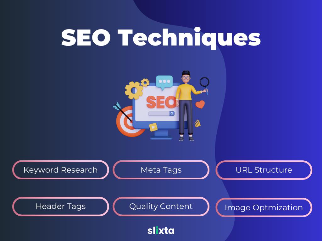
Applying SEO Techniques
Search engine optimization (SEO) is essential for improving the visibility of your landing pages in search engine results. By optimizing your landing pages for relevant keywords, you can attract organic traffic and increase the chances of conversions.

Here are some SEO best practices to consider:
- Keyword research: Identify relevant keywords and phrases that align with your landing page's topic and target audience. Use keyword research tools to uncover high-volume, low-competition keywords that you can incorporate naturally into your content.
- Meta tags optimization: Optimize your landing page's meta title and meta description to include your target keywords and compelling, concise descriptions that entice users to click through from search engine results pages.
- URL structure: Create clean, user-friendly URLs that include relevant keywords and accurately describe the content of your landing page. Avoid long, complex URLs with unnecessary parameters or numbers.
- Header tags: Use header tags (H1, H2, H3, etc.) to structure your landing page content and highlight important sections. Incorporate your target keywords into these tags to signal their relevance to search engines.
- High-quality content: Develop informative, engaging, and relevant content for your landing pages. Ensure that your content answers users' questions, provides valuable information, and encourages them to take the desired action.
- Image optimization: Optimize the file names and alt tags of your images with descriptive keywords. Compress images without sacrificing quality to improve page loading speed.
Leveraging Analytics and Tracking
Analytics and tracking tools provide valuable insights into the performance of your landing pages, helping you make data-driven decisions for optimization. Here's how you can leverage analytics:
- Track conversion goals: Define and set up conversion goals in your analytics tool to track specific actions visitors take on your landing page, such as form submissions or product purchases. Monitor the conversion rate and analyze the user journey to optimize your page accordingly.
- Use heatmaps: Heatmap tools provide visual representations of visitor interactions with your landing page, highlighting areas of high engagement and identifying potential areas of improvement. Analyze click patterns, scroll depth, and attention heatmaps to optimize your page layout and content placement.
- Conduct A/B testing: Use analytics to track the performance of different variations of your landing page during A/B tests. Compare conversion rates, bounce rates, and other metrics to identify the most effective elements and optimize your page accordingly.
- Monitor traffic sources: Analyze the sources of traffic to your landing page, such as organic search, paid ads, social media, or referral websites. Identify which channels are driving the most qualified traffic and allocate your marketing efforts accordingly.
- Analyze user behavior: Dive deeper into visitor behavior by analyzing user flow, session duration, and exit pages. Identify drop-off points or bottlenecks in the user journey and make adjustments to improve conversion rates.
- Monitor mobile performance: Use analytics to track the performance of your landing page on different devices and screen sizes. Identify any issues or discrepancies in mobile versus desktop performance and optimize accordingly.
- Implement tracking pixels: If you're running advertising campaigns or using retargeting strategies, implement tracking pixels to monitor the effectiveness of your campaigns and track conversions beyond the initial landing page visit.
- Regularly review and analyze data: Set up regular reporting and analysis routines to monitor the performance of your landing pages over time. Look for trends, patterns, and areas for improvement, and make data-driven decisions to optimize your pages for better results.
Conclusion
Creating effective landing pages requires careful planning, attention to detail, and a commitment to continuous improvement. By following the best practices outlined in this comprehensive guide, you can create landing pages that engage visitors, drive conversions, and achieve your marketing goals.
Keep in mind that every audience and industry is unique, so it's important to test and iterate based on your specific target market and goals. Monitor the performance of your landing pages, listen to user feedback, and adapt your strategies accordingly. With dedication and a commitment to continuous improvement, your landing pages can become powerful tools for driving conversions and achieving success in your digital marketing efforts.
With Slixta, you can create landing pages that engage and convert with ease. Our intuitive interface and user-friendly features make it simple for businesses of all sizes to create high-quality landing pages in a matter of minutes.
Slixta offers a wide range of attractive widgets that you can easily customize to match your brand's identity and messaging. From eye-catching forms to interactive elements, our widgets are designed to capture attention and encourage user engagement. You can effortlessly add videos, images, testimonials, and other compelling content to make your landing page more persuasive and impactful.

