Are you making it easy for your customers to buy from you? Optimising your eCommerce website and app for driving conversions plays a critical role in the success of D2C strategy for any brand.
Are you struggling to understand why prospective customers visit your eCommerce website but leave quickly? Are your visitors spending time on your website or app, yet not buying from you? Is your marketing just driving visitors, but not delivering conversions? Are you wasting your marketing budget?
The speed and performance of eCommerce website and app, the aesthetics (or User Interface, UI) and the browsing, navigation, search, buying experience (or User Experience, UX) all play critically important roles in driving eCommerce conversions.
A common mistake often made by brand owners is underestimating the need for creating an easy, enjoyable customer experience on the eCommerce platform. Delivering a great user experience goes well beyond branding colours and great product photography. A slightly better understanding of the role of few specific elements can go a long way in helping brand owners deliver good UX to their visitors, and thus ensuring better RoI for themselves.
Home and Landing pages
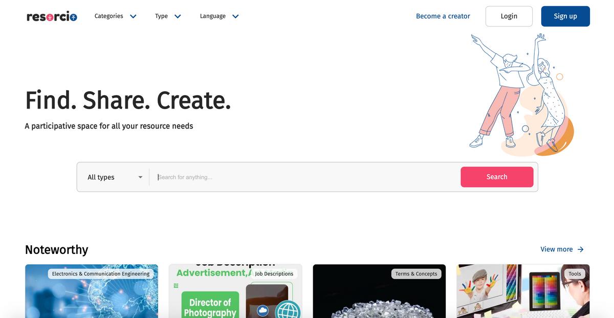
- Include a clear Call-to-Action (CTA) in the above-the-fold area of the home page and any landing pages. The objective is to guide visitors to a specific action that can help fulfill their objective of visiting the website. Keep the CTAs descriptive, simple and easy to understand. Note that even a well-placed search box can be a good CTA.
- Include a clear, benefit-oriented value proposition. This is a very short statement about the value of your product or why the visitor should buy the product from you.
- Display top categories on the home page as this helps most of your visitors quickly reach the product they are looking for.
- Include some social proof. This could be done by displaying the number of social media followers or the number of products sold (eg. "1 million sold") or the number of customers (eg. "1000,000 satisfied customers") or through testimonials etc.
- Avoid automatic carousels and full-page interstitials
- Use legible font sizes
Menu and Navigation
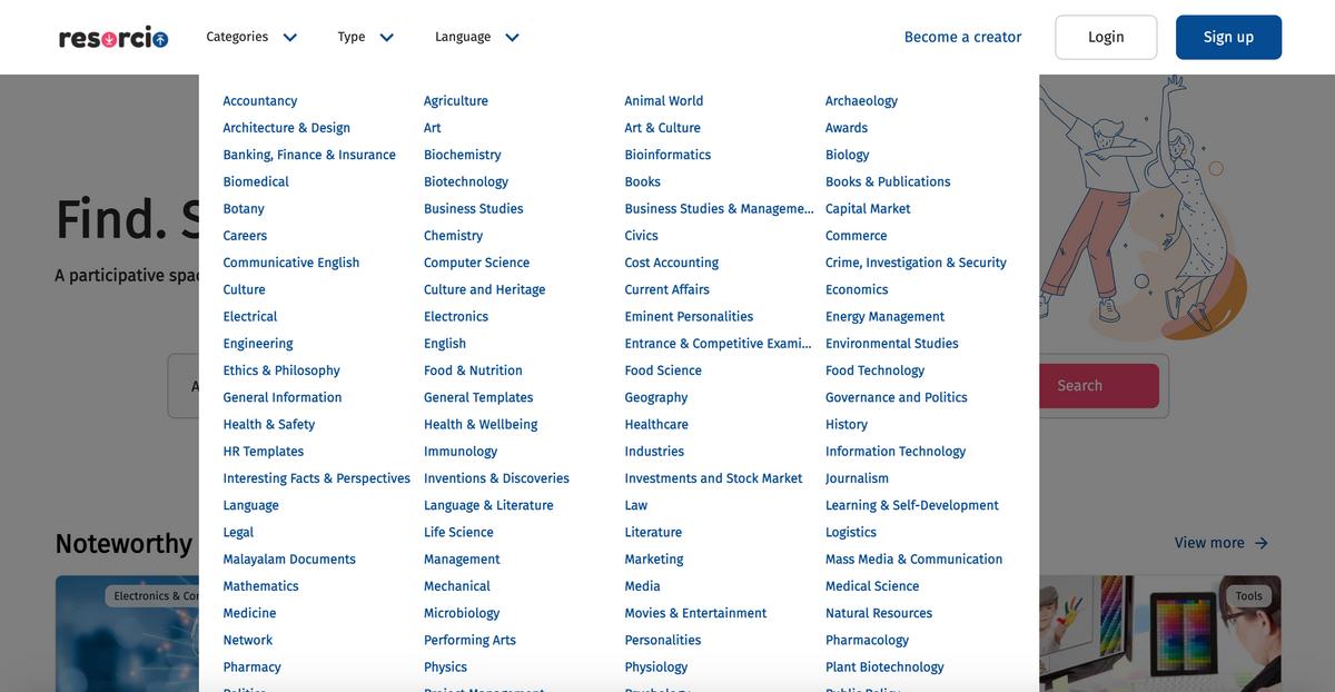
- Having a consolidated menu in the above-the-fold area can help users quickly understand how they can browse through the website and allow them to navigate the site specifically based on their interests.
- Keeping menu options together on one page allows users to quickly comprehend all options and makes navigation easy.

- Order initial categories by traffic and sub-categories alphabetically.

- If you would love to have your website visitors visit your physical store, it might a good idea to include "Store Locator" in the menu.
- If you would love to have your website visitors give you a call, include Click-to-Call on top of every page
- Consider including post-sales actions (eg. "Register for Warranty") in your menu options to make it easy for your customers. This also is a way to display your post sales services to new visitors.
Search
- Ensure that you have search enabled on your website, is visible and is easily accessible. Allow for searching both categories and products.
- Simplify the search process by enabling auto-suggestions and spelling corrections
- Make it easy for your users by including previous searches, top searches and trends.
- Always return some results on searches; be innovative and guide users to close possible alternatives, if required.
Category and Product Pages
- Ensure that key Product information, including pricing is available in the above-the-fold area. Ensure that product information can be easily readable.
- Include and re-iterate the value propositions. They could be category or product specific (eg. "10% off") or could be generic (eg. "Free shipping above $25").
- Provide sorting and filtering options if you are listing a large number of products. Including category-specific filters (eg. "Year", "Make" etc. for cars) makes it easy for your visitors to quickly reach the product they are searching for.
- Always return results on searches; be innovative and guide users to close possible alternatives, if required.
Checkout
- Keep it simple by removing unnecessary navigation options. They can be distracting and lure the customer away from the checkout process. However, do ensure important information like FAQs, Return Policies etc. are easily accessible. Home page and Cart page should also be easily accessible.
- Keep payment experience simple and easy. Messaging and communication should be accurate and clear. Integration with modern payment gateways makes this easy.
The ultimate goal of any eCommerce website or app is to help visitors easily find and buy the products they are looking for. For brands that really care about the customer experience, this is an area of continuous improvement; for which they are rewarded both in the short and long term.
