Facebook Landing Pages are standalone web pages created specifically for Facebook ad campaigns. They serve as the destination where users "land" after clicking on an ad. These pages are designed to capture leads, promote offers, or encourage specific actions. By providing a seamless and targeted experience, Facebook Landing Pages maximize the effectiveness of ad campaigns and boost conversion rates.
Let's step into the shoes of a potential customer who's browsing through Facebook during a quick break. While checking out the moments of friends and family, they stumble upon your eye-catching advertisement for cutting-edge smartwatches.
Facebook's clever algorithms have identified their interest in fitness gadgets, making them the perfect target audience for your product. Intrigued, they click on your ad with the intention to explore further.
However, instead of being directed to a specialized landing page showcasing the latest smartwatches, they find themselves on your website's homepage, bombarded with various product categories and options.
With only a few minutes, the distraction causes them to abandon their purchase intent. Where did it go wrong?
In this article, we understand the importance of dedicated Facebook landing pages and how they can dramatically increase your chances of converting interested prospects.
We'll also reveal powerful optimization strategies to ensure your landing pages leave a lasting impact.
Understanding Your Audience: What Makes Them Tick
The foundation of any successful marketing campaign is understanding your audience inside out. Take the time to gather insights into their preferences, pain points, and desires. Use Facebook's analytics and insights to get a clear picture of your audience demographics, interests, and online behaviors. Armed with this knowledge, you can tailor your landing page content and design to cater specifically to your target audience.
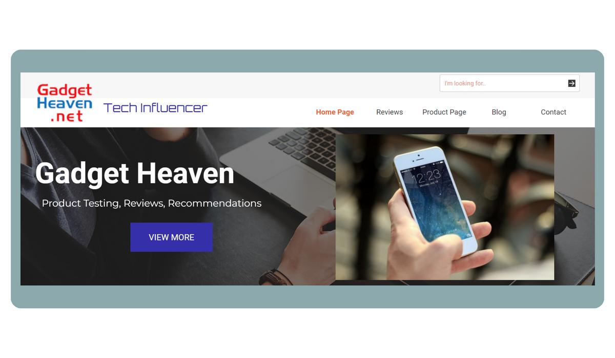
Example: Let's take the fictional company "Gadget Haven" as an example. Through Facebook insights, they discovered that their target audience consists mainly of tech-savvy millennials who value innovation and sleek design. With this understanding, "Gadget Haven" crafted a landing page highlighting the cutting-edge features of their latest smartphone, incorporating trendy visuals that resonated with their audience.
Crafting Compelling Headlines and Copy
In the world of social media, attention spans are limited, and the competition for users' attention is fierce. To make a lasting impression, your landing page needs to have an attention-grabbing headline and persuasive copy that conveys your message concisely. Use powerful and action-oriented language to urge users to take the desired action, whether it's signing up for a newsletter, making a purchase, or requesting a demo.
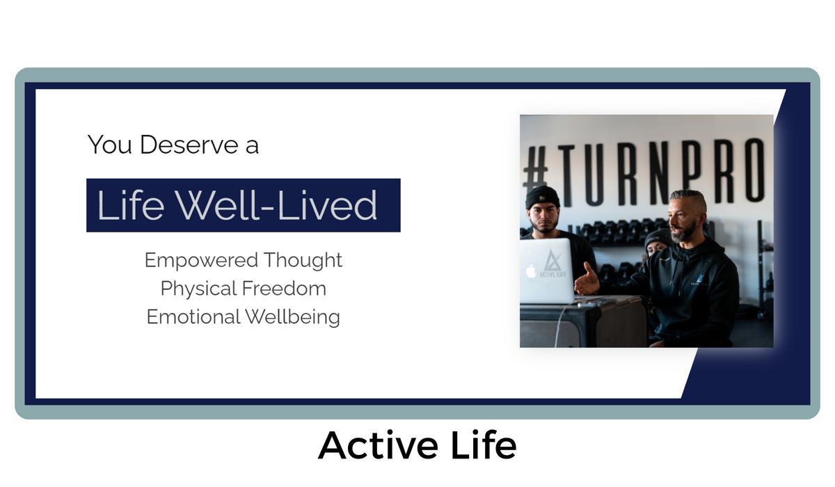
Example: The fitness company "ActiveLife" nailed this aspect by creating a landing page with the headline "You Deserve a Life Well-Lived" They utilized strong verbs like "deserve" and "a life" to create a sense of empowerment and urgency, prompting users to explore their fitness programs further.
A Visual Feast: Engaging Images and Videos
Humans are visual creatures, and visuals can make or break your Facebook landing page. Invest in high-quality images and videos that align with your brand's identity and message. Choose images that evoke emotions and resonate with your audience. If you're showcasing a product, use professional images and videos that highlight its features and benefits.
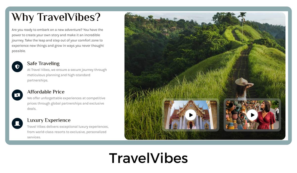
Example: "TravelVibes" a travel agency, brought wanderlust to life with their landing page featuring breathtaking images of exotic destinations and adventurous activities. The immersive video of travelers exploring stunning landscapes boosted user engagement and conversions.
Streamlined and Intuitive Design
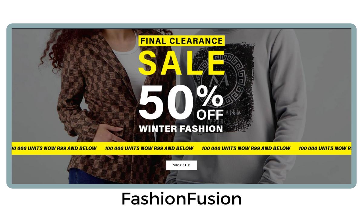
Simplicity is key when it comes to Facebook landing pages. Keep the design clean, uncluttered, and aligned with your brand's aesthetic. Ensure that the page is easy to navigate, and the call-to-action (CTA) button is prominently placed and stands out from the rest of the content. Avoid distractions that may divert users from your main goal.
Example: The e-commerce store "FashionFusion" adopted a minimalist design approach with a straightforward layout that directed attention to their CTA button. As a result, visitors could easily explore their latest collection and complete their purchases effortlessly.
Mobile Optimization: Don't Neglect Your Mobile Users
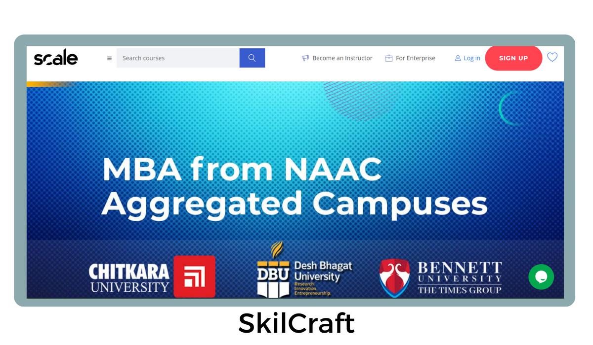
With the majority of Facebook users accessing the platform through mobile devices, optimizing your landing page for mobile is non-negotiable. Ensure that your page is responsive and loads quickly on smartphones and tablets. Text should be easy to read, images should be well-adjusted, and forms should be user-friendly on smaller screens.
Example: The online learning platform "SkillCrafters" recognized the importance of mobile optimization. Their landing page seamlessly adapted to various screen sizes, offering users a smooth learning experience, whether they were on their laptops or smartphones.
Social Proof: Building Trust and Credibility
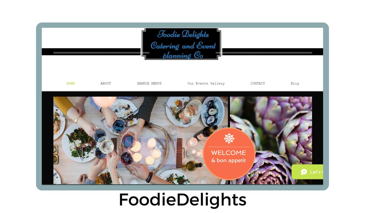
Incorporate social proof elements into your landing page to build trust among potential customers. Testimonials, customer reviews, case studies, and trust badges can convince users that your product or service is worth their time and money. Genuine user experiences can tip the scales in your favor.
Example: "FoodieDelights" showcased glowing reviews from satisfied customers, along with a "Best Restaurant 2022" badge they received from a renowned food magazine. This social proof played a pivotal role in encouraging visitors to make reservations at their restaurant.
A/B Testing: Optimizing for Success
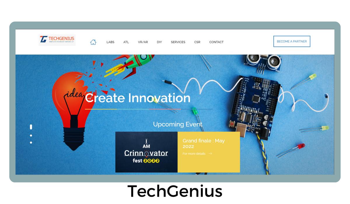
Optimizing your Facebook landing page is an ongoing process, and A/B testing is a valuable tool in your arsenal. Test different elements such as headlines, CTA buttons, images, and layouts to identify what resonates best with your audience. Analyze the data and make data-driven decisions to continually improve your landing page's performance.
Example: The software company "TechGenius" conducted A/B tests on their landing page to compare two different CTA button texts. They discovered that using "Get Your Free Trial Now" resulted in a higher conversion rate compared to "Try for Free."
Personalization: Connecting on a One-to-One Level
Personalization can set your Facebook landing page apart from the rest. Use dynamic content to tailor the page based on user data such as location, interests, or past interactions. By addressing visitors by their names and offering relevant recommendations, you can create a more intimate connection with your audience.
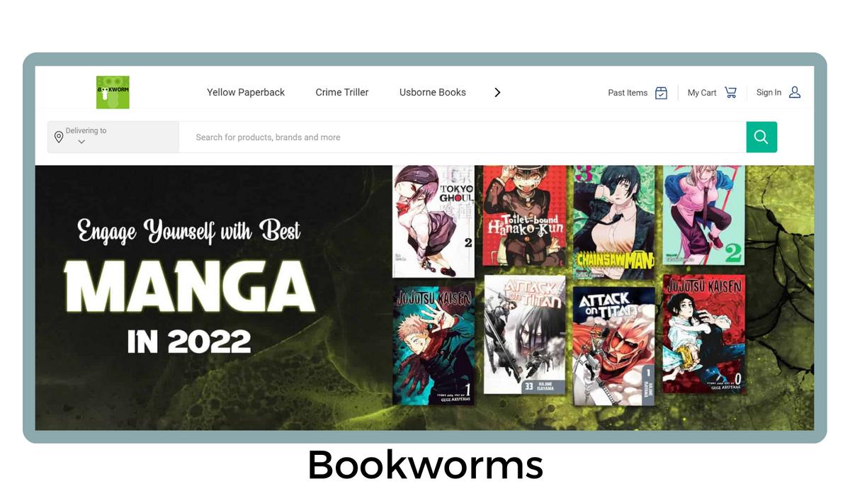
Example: The online bookstore "BookWorms" implemented personalization by showcasing book recommendations based on users' past purchases and browsing history. Visitors were delighted to see curated lists of books that matched their literary preferences, increasing the likelihood of making a purchase.
Urgency and Scarcity: Driving Action
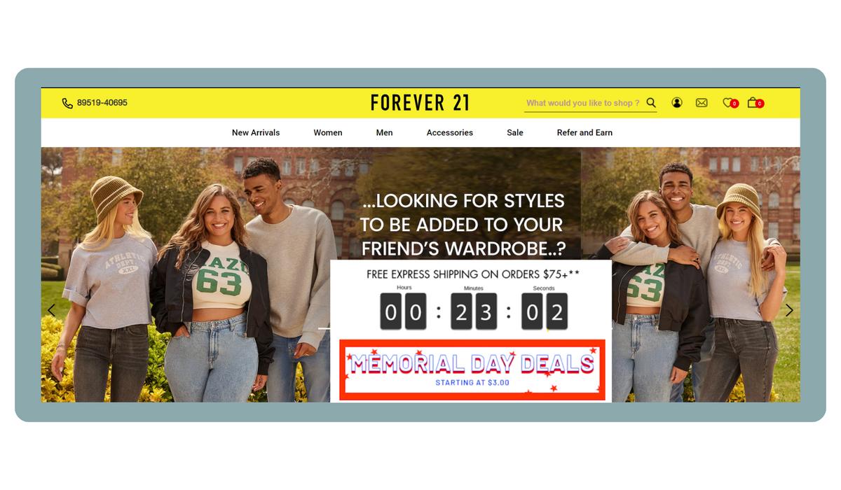
Creating a sense of urgency and scarcity on your Facebook landing page can be a powerful motivator for users to take immediate action. Limited-time offers, exclusive deals, or countdown timers can create a fear of missing out (FOMO), compelling users to convert quickly.
Example: The online fashion retailer "Forever 21" effectively utilized a countdown timer to create a sense of urgency and excitement around their flash sale. The limited-time nature of the sale, combined with the dynamic countdown timer, motivated visitors to take immediate action and browse through the latest summer fashion offerings. The timer ticking down in real-time added a level of urgency, encouraging potential customers to make purchases before the sale expired.
Landing Page Speed: The Need for Lightning-Fast Load Times
In the fast-paced world of social media, speed is of the essence. Slow-loading landing pages can lead to high bounce rates and lost opportunities. Optimize your page's loading speed by compressing images, minimizing HTTP requests, and leveraging browser caching to create a seamless user experience.
Integration with Facebook Pixel: Tracking and Measuring Success
Facebook Pixel is a powerful tool that enables you to track user interactions on your landing page and measure your ad campaign's effectiveness. Integrate Facebook Pixel with your landing page to gain valuable insights into user behavior, such as conversions, page views, and sign-ups. These data-driven insights will help you refine your marketing strategy and drive better results.
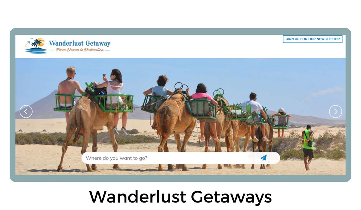
Example: The online travel agency "WanderlustGetaways" integrated Facebook Pixel into their landing page. They tracked the number of users who completed the booking process and used the data to optimize their ad campaigns, resulting in higher bookings and revenue.
Testing Social Sharing: Expanding Your Reach
Encourage visitors to share your landing page content on their social media platforms. Include social sharing buttons to make it easy for users to share interesting offers or valuable content with their friends and followers. This organic sharing can expand your reach and attract potential customers.
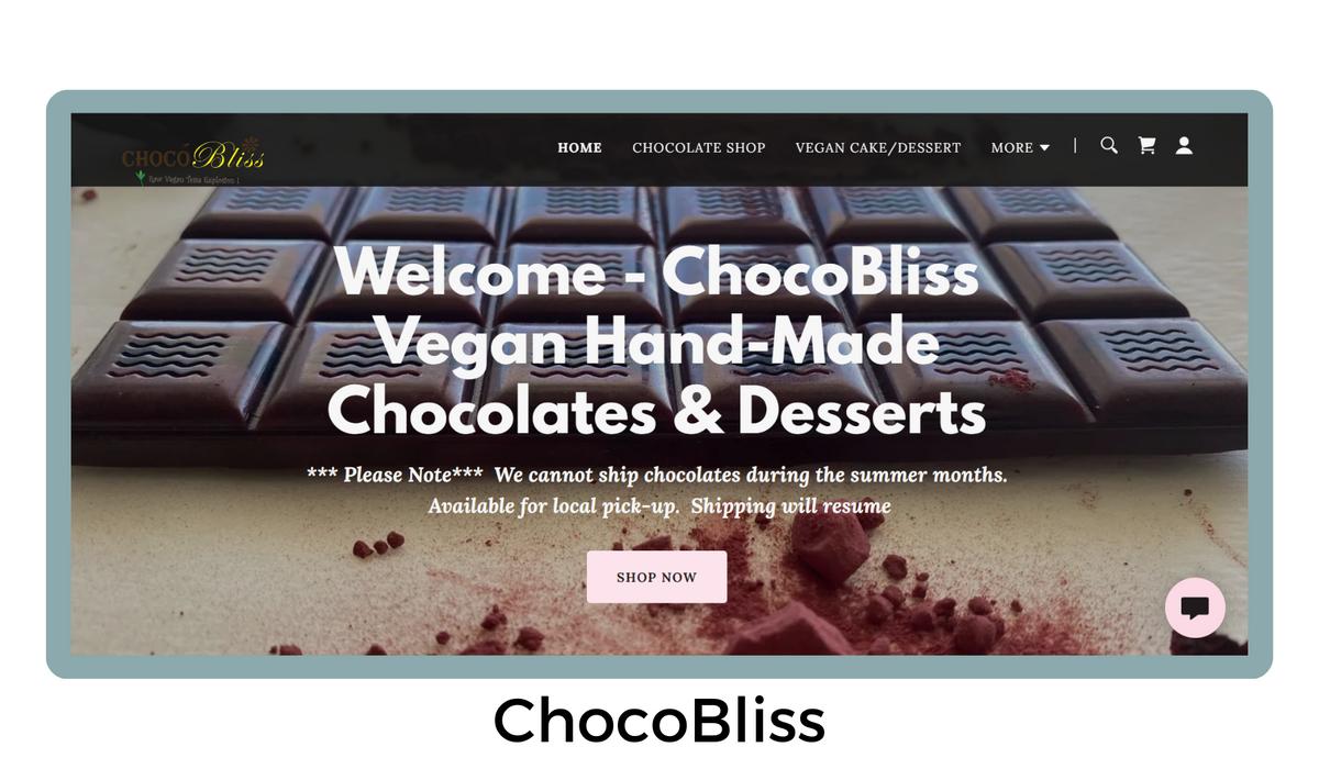
Example: The gourmet chocolate brand "ChocoBliss" added social sharing buttons to their landing page, allowing visitors to share their limited-edition chocolate box offer. The campaign went viral on Facebook, leading to a significant increase in website traffic and sales.
Compliance with Facebook Guidelines: Stay in the Good Books
To avoid any setbacks with your Facebook marketing efforts, ensure that your landing pages comply with Facebook's guidelines and policies. Violations can lead to penalties, ad disapprovals, or even account suspensions. Review and adhere to Facebook's advertising policies to maintain a healthy and successful marketing campaign.
Conclusion
Are you ready to take your Facebook ad campaigns to the next level?
Explore the power of Slixta, a cutting-edge platform that empowers digital brands to create landing pages for maximum conversions.
With Slixta's user-friendly interface and a plethora of interactive widgets, you can craft landing pages that not only capture attention but also engage your audience like never before.
