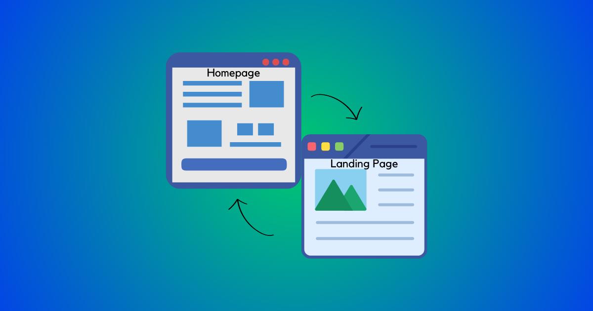
A landing page is a standalone web page designed for specific campaigns, while a homepage serves as the main entry point to a website. Landing pages focus on conversions, while homepages provide overall navigation and information. Both are important for effective online presence and user experience.
When it comes to creating a powerful online presence for your business, the design and functionality of your website play a crucial role.
As a business owner, you want to ensure that every aspect of your website is optimized to engage your visitors, generate leads, and ultimately drive conversions.
Two key components of your website that deserve special attention are the landing page and the homepage.
But what exactly are they, and how do they differ from each other? In this blog post, we'll explore the differences between landing pages and homepages, their unique purposes, and when to use each one effectively.
The Homepage: The Face of Your Business
Your homepage is the virtual front door of your website. It's the first page that visitors see when they arrive at your site, and it serves as a gateway to the rest of your content.
Here are a few key points to consider about your homepage:
Overview and Navigation
The homepage should provide an overview of your business and its main offerings. It should also have a clear and intuitive navigation menu that guides visitors to different sections of your website. For example, if you're an e-commerce store, your homepage might showcase your featured products, categories, and promotions.
Brand Storytelling
Use your homepage to tell your brand's story, showcasing your unique value proposition, mission, and vision. A compelling brand story helps build trust and emotional connections with your audience. For instance, a sustainable fashion brand might highlight its commitment to ethical manufacturing and eco-friendly materials.
Call-to-Action (CTA)
While the primary goal of your homepage is to provide information and create a positive first impression, it should also include strategic CTAs. These can be in the form of buttons or banners that encourage visitors to take a specific action, such as signing up for a newsletter, exploring a product line, or contacting your sales team.
Social Proof
Including social proof elements on your homepage, such as customer testimonials, awards, or case studies, can enhance your credibility and reinforce trust in your brand.
Responsive Design
Ensure your homepage is mobile-friendly and optimized for various devices. With the increasing number of users accessing the internet through smartphones and tablets, a responsive design is crucial for providing a seamless browsing experience.
Landing Pages: Focused Conversion Powerhouses
While the homepage serves as a gateway to your website, landing pages are designed with a specific purpose in mind—to convert visitors into leads or customers.
Here's what you need to know about landing pages:
Single Objective
Unlike the homepage, which provides an overview of your business, landing pages have a singular focus. They are created with a specific goal, such as promoting a product, offering a free resource, or driving registrations for an event.
Simplicity and Clarity
Landing pages should be simple and uncluttered, with a clear and concise message. Avoid overwhelming visitors with excessive information or distracting elements. Instead, focus on communicating the key benefits and value proposition of your offer.
Compelling Headline and Subheadline
Grab visitors' attention with an attention-grabbing headline and supporting subheadline that highlights the main value proposition. Use compelling language and persuasive copywriting techniques to entice visitors to take action.
Eye-Catching Visuals
Incorporate visually appealing elements, such as high-quality product images, infographics, or videos, to enhance engagement and communicate your message effectively.
Lead Capture Form
Landing pages often include a lead capture form where visitors can provide their contact information in exchange for the offer or resource you're providing. Keep the form simple and ask for only essential information to increase conversion rates.
Clear Call-to-Action
Every landing page should have a clear and prominent call-to-action button or link that directs visitors to take the desired action. Use action-oriented language and place the CTA where it's easily visible.
When to Use Landing Pages vs. Homepages
Now that we've explored the characteristics and purposes of landing pages and homepages, let's discuss when to use each one effectively:
When to Use a Homepage:
- You want to establish your brand's credibility and authority in the industry.
- You have multiple product lines or a wide range of services to showcase.
- You want to provide a comprehensive overview of your business's different offerings or services.
- You aim to create brand awareness and foster long-term customer relationships.
- You need to provide comprehensive support and resources for your existing customers.
When to Use a Landing Page:
- You are running targeted advertising or marketing campaigns.
- You want to align with specific ads or promotions, ensuring a seamless experience.
- You want to track and measure the success of a specific campaign or promotion.
- You want to generate buzz and excitement for a new product or service.
- You are conducting A/B testing or experimenting with different marketing strategies.
Using these guidelines, you can effectively determine whether a homepage or a landing page is the most appropriate choice based on your specific objectives and target audience. Remember, both the homepage and landing pages play vital roles in your website strategy, and understanding when to use each will help you optimize your website for maximum impact and conversions.
