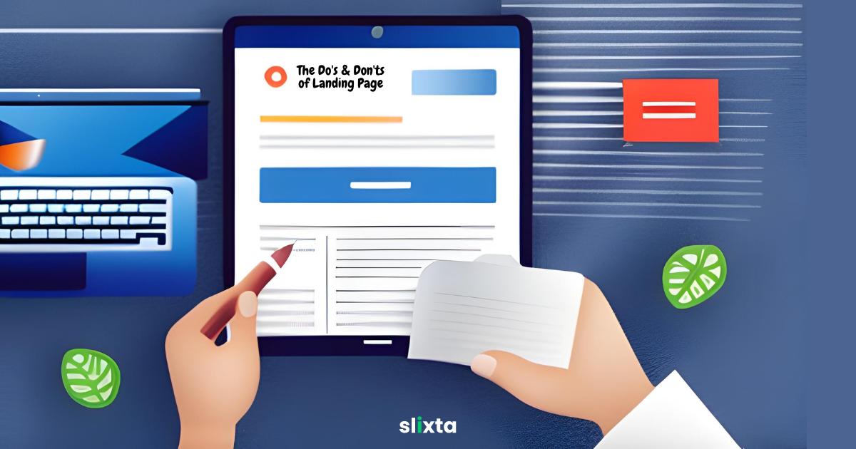
Mastering the art of creating a captivating landing page involves understanding the essential principles that lead to success. By following the right practices and avoiding common pitfalls, you can create a landing page that effectively engages your audience, communicates your message, and drives desired actions.
When it comes to crafting an effective landing page, it's essential to understand the best practices and avoid common pitfalls. By implementing the right strategies, you can ensure that your landing page not only grabs attention but also compels visitors to take the desired action, whether it's making a purchase, signing up for a newsletter, or filling out a form.
In the following sections, we will dive into the dos and don'ts of creating a landing page, covering everything from design and layout to copywriting and call-to-action buttons. Let's explore the key elements that will make your landing page stand out and deliver exceptional results.
Do’s 🟢
Use a visually pleasing color scheme
- When designing your landing page, opt for colors that resonate with your brand and evoke positive emotions.
- A visually appealing color scheme can create a memorable experience for your visitors and reinforce your brand identity.
- Select a harmonious combination that enhances readability and draws attention to important elements.
Examples: Airbnb's landing page embraces a calming blue color scheme, reflecting their commitment to providing a peaceful travel experience.
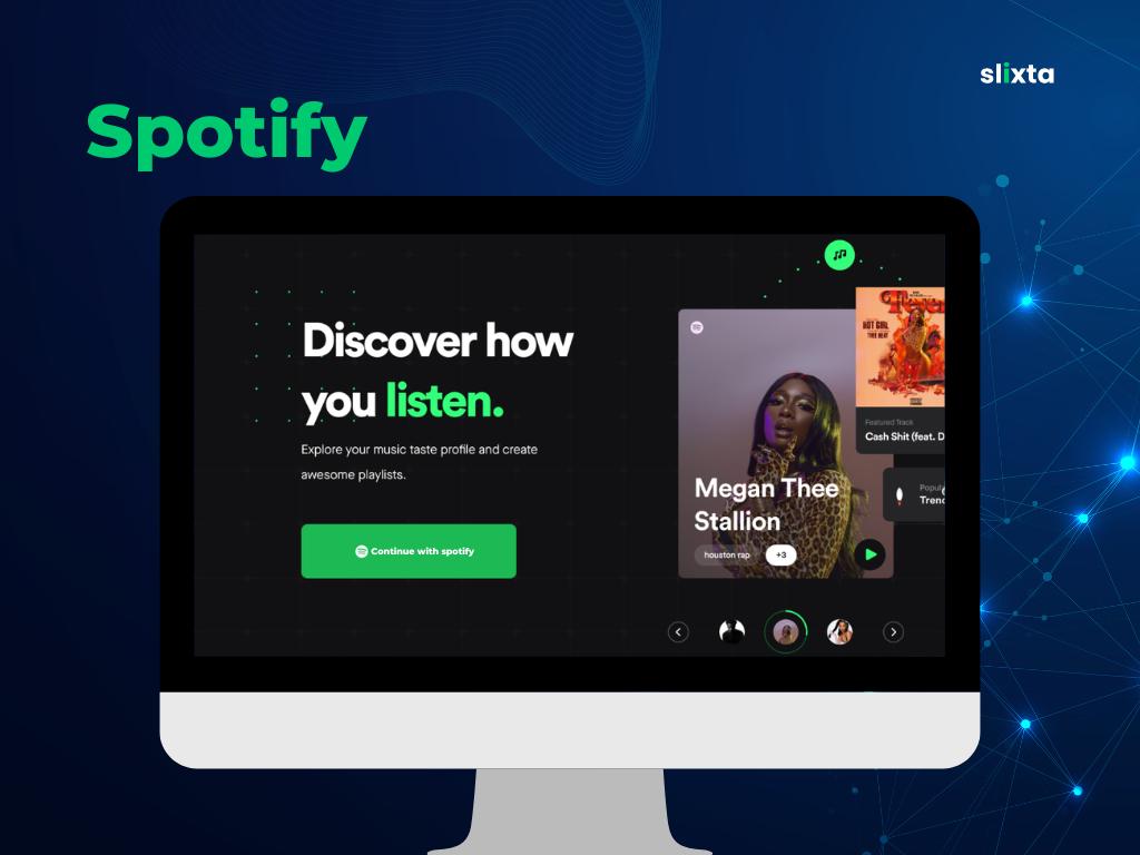
Similarly, Spotify employs vibrant green hues to evoke a sense of energy and excitement.
Create a Compelling Call-to-Action (CTA)
- Place a prominent and visually appealing CTA button that stands out from the rest of the page.
- Use action-oriented language to encourage visitors to take the desired action.
- Clearly state what visitors can expect when they click on the CTA.
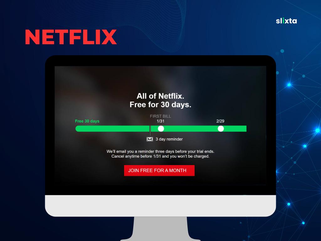
Example: Netflix's landing page for their streaming service features a prominent red CTA button with the text "Join Free for a Month." This CTA clearly communicates the desired action and the incentive of a free trial, encouraging visitors to sign up and explore their vast collection of movies and TV shows.
Optimize for Mobile
- Design your landing page with a mobile-first approach, as a significant portion of website traffic comes from mobile devices.
- Ensure that your landing page is responsive and adapts seamlessly to different screen sizes.
- Optimize load times to prevent mobile users from experiencing frustration or abandonment.
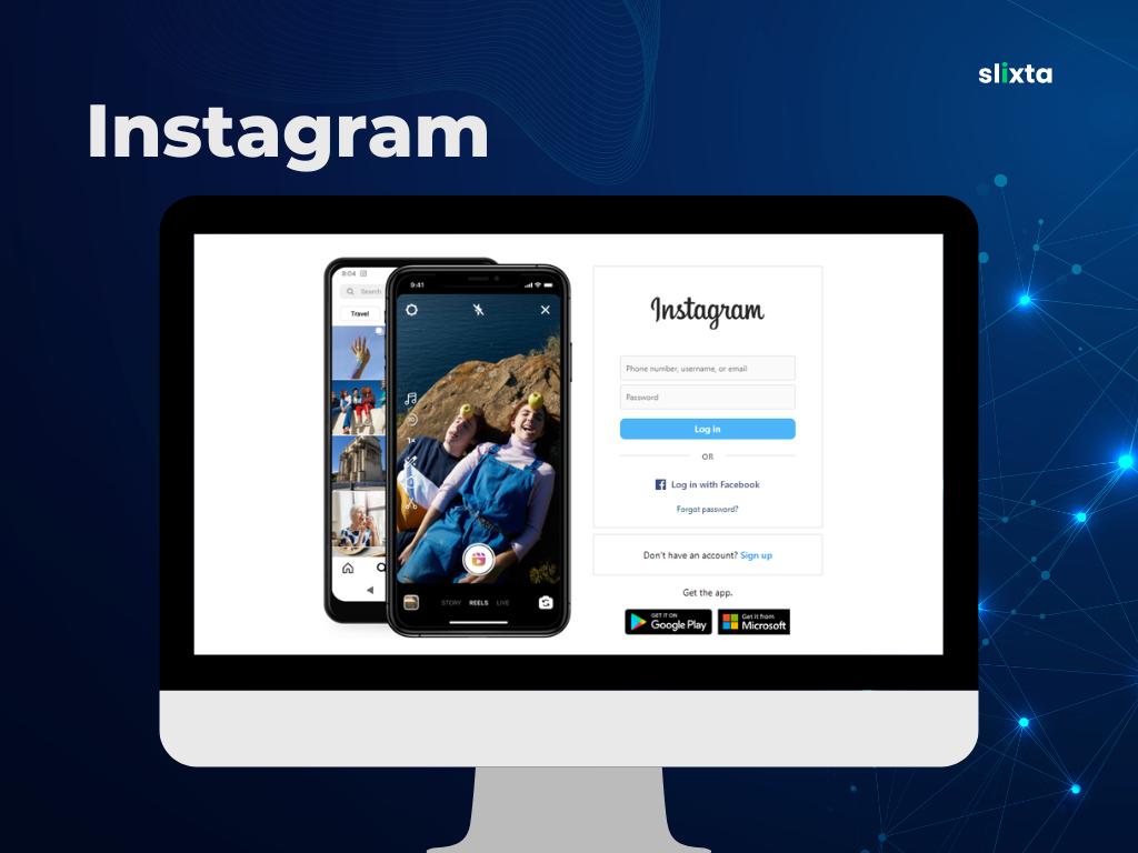
Example: Instagram's landing page ensures a seamless mobile experience by providing a mobile-responsive design that adapts to different screen sizes. The landing page showcases visually appealing images and succinctly communicates the platform's value proposition as a visual-centric social media platform.
Incorporate Trust Signals
- Include trust badges, customer testimonials, or reviews to instill confidence in your visitors.
- Showcase social proof, such as the number of satisfied customers, awards, or partnerships.
- Highlight any security measures you have in place to protect customer information.
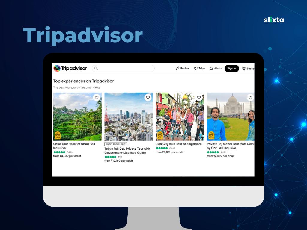
Example: TripAdvisor's landing page for hotel bookings includes trust signals such as user reviews, ratings, and badges highlighting the number of travelers who have booked through their platform. These trust signals instill confidence in potential customers by showcasing social proof and validating the reliability of the service.
A/B Test and Continuously Improve
- Conduct A/B tests to compare different versions of your landing page and identify areas for improvement.
- Test variations of headlines, visuals, CTAs, and overall page layout.
- Analyze data and user feedback to refine your landing page and optimize its performance.
Example: Spotify regularly conducts A/B tests on their landing pages to optimize conversion rates. They test different variations of headlines, CTA button colors, and page layouts to determine what resonates best with their target audience. By constantly analyzing data and making iterative improvements, Spotify ensures their landing pages deliver the best possible results.
Now that we've explored the dos, let's take a look at the don'ts of creating a landing page.
Don'ts 🔴
Overwhelming Visitors with Excessive Information
- Avoid cluttered designs, excessive text, or too many images that can confuse or distract visitors.
- Focus on key information that directly supports your value proposition and conversion goals.
- Use concise and clear language to communicate your message effectively.
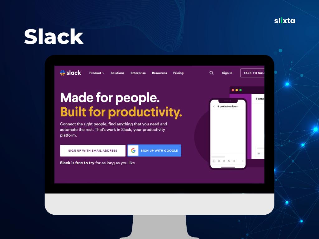
Example: Slack's landing page avoids overwhelming visitors with excessive information. Instead, it highlights the platform's core features and benefits in a concise and easy-to-digest manner.
Neglecting Page Load Speed
- Optimize your landing page to ensure fast loading times.
- Compress images, minify code, and leverage caching techniques to reduce load times.
- Slow-loading pages can lead to higher bounce rates and lower conversions.
Example: Google's landing pages are renowned for their fast load times. By optimizing its page performance, Google provides a smooth and seamless user experience, reducing the risk of users leaving the page due to slow loading times.
Using Jargon or Complex Terminology
- Avoid using industry-specific jargon or complex terminology that may confuse or alienate your audience.
- Use clear and simple language that is easily understood by a wide range of visitors.
- Aim to create a user-friendly experience that appeals to both experts and newcomers in your field.
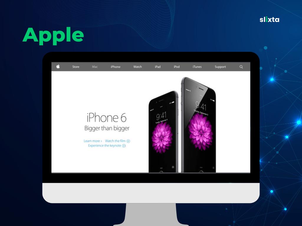
Example: Apple's landing pages are known for their simplicity and accessibility. They avoid technical jargon and present the features and benefits of their products in a way that anyone can understand, regardless of their level of technical expertise.
Neglecting Mobile Responsiveness
- Ensure that your landing page is fully optimized for mobile devices.
- Test your landing page on various mobile devices and screen sizes to ensure a seamless user experience.
- Failure to provide a responsive design can lead to frustrated visitors and missed conversion opportunities.
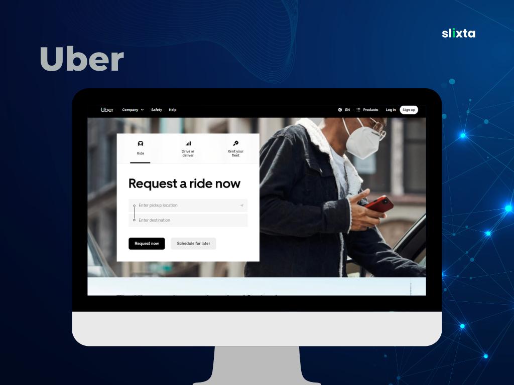
Example: Uber's landing page is designed with a strong emphasis on mobile responsiveness. The page adapts fluidly to different screen sizes, providing a consistent and user-friendly experience for visitors accessing the page from their smartphones. This mobile optimization contributes to a smoother onboarding process for new users.
Forgetting Clear Navigation and Accessibility
- Make sure your landing page has a clear and intuitive navigation structure.
- Include a visible menu or links to other relevant pages on your website.
- Ensure that your landing page is accessible to all users, including those with disabilities.
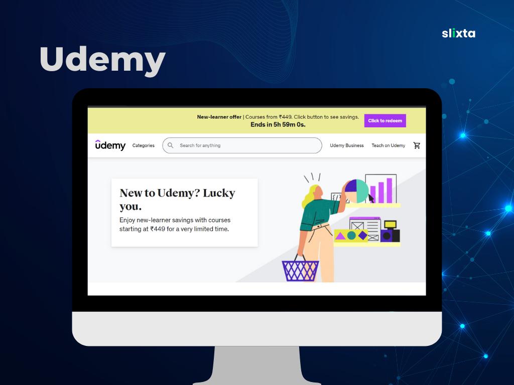
Example: Udemy's landing page for an online course on web design demonstrates clear navigation and accessibility. The navigation menu remains visible as users scroll down the page, ensuring easy access to relevant information. Furthermore, Udemy ensures accessibility by incorporating descriptive alt text for images and providing closed captions for video content, making the landing page inclusive for users with disabilities.
Underestimate the Power of Visuals
- Use high-quality, relevant visuals that align with your brand and resonate with your target audience.
- Avoid using generic stock photos that may appear impersonal or unrelated to your offering.
- Opt for real-life examples or captivating imagery that evokes emotions and tells a story.
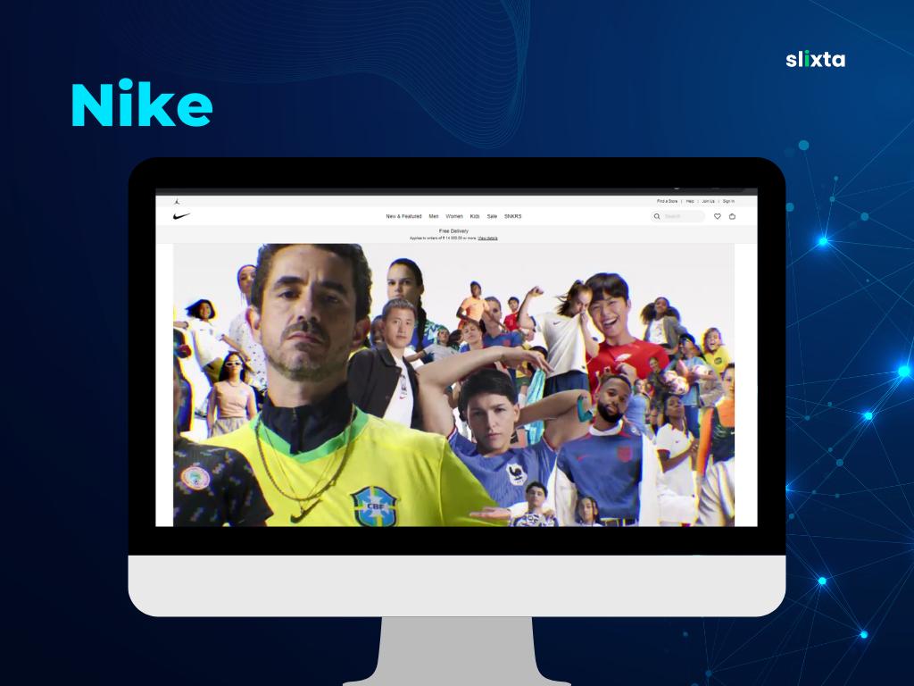
Example: Nike's landing pages often feature powerful visuals of athletes in action, capturing the brand's spirit of athleticism and determination. These visuals create an emotional connection with the audience and inspire them to explore Nike's products and lifestyle.
Neglect Testing and Optimization:
- Don't settle for a single version of your landing page without testing alternatives.
- Continuously test different elements such as headlines, visuals, CTAs, and page layouts.
- Use analytics and user feedback to identify areas for improvement and make data-driven optimizations.
Example: Microsoft regularly conducts A/B testing on their landing pages to optimize user engagement and conversion rates. They test variations of headlines, visuals, and CTAs to determine which combinations resonate best with their target audience. This approach allows Microsoft to refine their landing pages for maximum effectiveness.
Conclusion
Creating a high-performing landing page requires a combination of effective design principles, clear messaging, and user-centered optimization. By following the dos and avoiding don'ts outlined in this guide, you'll be well on your way to creating landing pages that engage, convert, and drive the success of your business.
Remember, landing pages are not set in stone. Continuously test, analyze, and refine your landing pages to adapt to changing user preferences and market dynamics. With dedication and a data-driven approach, you'll be able to create landing pages that truly make an impact.
We hope you found this guide helpful! If you have any questions or need further assistance, please don't hesitate to reach out. Good luck with your landing page creations!
