
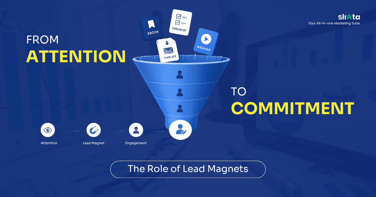
From Attention to Commitment: The Role of Lead Magnets
Jul 15, 2026
Lead magnets turn anonymous website interest into an opportunity to continue the conversation. When matched with the right popup timing and placement, they give visitors a smaller next step before they are ready to commit.
From Attention to Commitment: The Role of Lead Magnets
The average website converts between 1 and 3 percent of its visitors.
That means for every 100 people who find you, read about you, and consider you, 97 leave without a trace. No name. No number. No way to continue the conversation.
Most businesses respond to this by spending more on traffic. More ads. More SEO. More budget pointed at the top of the funnel, as if the problem is that not enough people are arriving, when the real problem is what happens to them once they do.
A lead magnet is the answer to a different question entirely. Not "how do we get more people here" but "how do we make leaving harder than staying."
What a Lead Magnet Actually Does
A lead magnet is an offer. Something specific, immediately useful, and genuinely valuable enough that a visitor will exchange their contact details to receive it.
Its role, however, goes beyond collecting an email address.
A lead magnet creates a bridge between interest and commitment. It gives visitors who are not yet ready to book a consultation or speak to sales a smaller, more comfortable next step. Instead of forcing a decision they are not ready to make, it keeps the relationship alive while they continue evaluating their options.
But even the best lead magnet cannot succeed if it appears at the wrong moment.
A lead magnet is only effective when it appears at the right moment. Show it too early and it feels like an interruption. Show it too late and the opportunity is gone.
That is where popups come in.
A popup is not the strategy. It is simply the delivery mechanism for the lead magnet. Different popup triggers create different opportunities to present the same offer, depending on where the visitor is in their journey. The question is no longer just what you should offer, but when you should offer it.
Some Decisions Cannot Be Rushed
One of our clients gets 90% of their website leads from a single exit-intent popup with a lead magnet download.
Not the hero section. Not the sticky CTA bar that follows you down the page. Not the contact form at the bottom that everyone scrolls past.
The moment of almost-leaving.
That number is worth sitting with. Ninety percent.
And it makes complete sense once you understand the category they operate in.
There are entire service industries where a "Book Now" button is, by design, the wrong ask. Not because the website is poorly built. Not because the offer is weak. Because the buyer simply is not there yet, and no amount of urgency copywriting will move them to a place they haven't arrived at on their own.
Insurance, Mortgages, Legal consultations, HR services, Home renovations, Aesthetic treatments, these are considered decisions. Nobody wakes up on a Tuesday and refinances their home by noon. Nobody browses a med spa website for three minutes and immediately books a laser procedure.
The research phase in these categories is long. The trust bar is high. And the gap between "I'm interested" and "I'm ready to talk to someone" can be days, sometimes weeks.
Not All Popups Are the Same Conversation
Before getting into what works, it helps to understand what's actually available, because most businesses use one type of popup by default and never ask whether it was the right one for what they were trying to do.
An entry popup fires the moment someone lands. It introduces itself before the visitor has seen anything. High visibility, but low trust, because the visitor hasn't decided yet whether they even want to be here.
A timed popup appears after someone has spent a set amount of time on the page. It is a better signal than entry, because time on page suggests genuine interest. The risk is getting the timing wrong and interrupting someone mid-read.
A scroll-based popup triggers after a visitor reaches a certain depth in the page. If someone has scrolled 60% down your service page, they are not browsing casually. That depth is intent, and a popup at that point is a response to behaviour rather than an assumption about it.
An exit-intent popup fires when the cursor moves toward leaving. It is the last possible threshold moment, the final chance to offer something before the visitor disappears.
And then there is Placement. Even with the right trigger, the way a popup appears changes how visitors experience it. Placement determines whether the offer feels like a helpful suggestion or an obstacle standing between the visitor and what they came to do.
A popup that covers the entire screen on mobile demands immediate attention, but it also interrupts the experience more aggressively. If the value isn't instantly obvious, visitors are more likely to dismiss it out of frustration than curiosity.
A corner slide-in on the desktop takes the opposite approach. It stays visible without blocking the page, allowing visitors to keep reading while deciding whether the offer is worth exploring. It earns less attention, but it also creates less resistance.
A full-screen takeover commands the highest level of visibility, making it useful for genuinely important offers. But because it interrupts the visitor completely, it has to justify that interruption with something valuable enough to deserve it.
Placement isn't a design preference. It's part of the conversation you're having with the visitor hence the key is: The more disruptive the format, the more valuable and well-timed the offer needs to be.
The type and placement are not aesthetic decisions. They are strategic ones, because each combination asks a different question at a different moment of the visitor's journey. Getting that match wrong means showing the right offer to the wrong version of the same person.
What the Cursor Actually Means
When a visitor spends three minutes on your website, browses your services, reads your credentials, and then moves their cursor toward the back button, they are not saying no.
They are saying they need more time.
That distinction matters enormously, because the entire response changes depending on how you read it.
If you read it as rejection, you let them leave and go spend more on acquisition to replace them.
If you read it as hesitation, you create one more moment. A smaller ask. A softer yes.
That is exactly what an exit-intent popup with the right offer does. It catches the threshold. It says, before you go, here is something worth taking with you.
And because it does not ask for a booking, because it asks only for a name and a number in exchange for something genuinely useful, the psychological weight of saying yes drops dramatically.
A much easier yes is still a yes.
Optimising for the Wrong Conversion Event
Most businesses in considered-purchase categories are not failing because their traffic is bad or their product is weak.
They are failing because they are optimising for the wrong conversion event.
They are pushing "Schedule a Call" at visitors who are still at "Maybe I should look into this."
The right ask at the wrong stage does not just fail to convert. It loses the lead entirely, because it signals a misunderstanding of where the buyer actually is. And buyers who feel rushed or misread do not come back.
This is where most teams hit a wall they did not build themselves. The popup fires. The lead comes in. And then it lands in an inbox, a spreadsheet, or a CRM field that nobody checks until Friday. The captured moment goes cold not because the system failed dramatically, but because nothing was waiting on the other side of the yes.
Slixta closes that gap before it opens. The moment a lead is captured through a popup or any other touchpoint, it is already inside a system that knows what page they were on, what they downloaded, and what the logical next step is. The nurture sequence starts automatically, without anyone having to move the lead manually from one tool to another. The moment is caught, and the follow-up is already in motion while the intent is still warm.
The funnel's job in a long-consideration category is not to close.
It is to stay in the conversation long enough for the buyer to get there on their own timeline.
Capture first. Earn the call second.
Building the System Around the Right Moment
Knowing when to ask is only half of it.
The placement of the popup, the type of trigger, the offer behind it, and the sequence that follows all have to be designed as one connected decision, not four separate ones made by four different people in four different tools.
A scroll-based popup with a relevant lead magnet on a high-intent service page will outperform an entry popup with a generic offer every single time. Not because one format is better than the other, but because one of them is reading the room and the other is ignoring it.
The best popup strategy is the one that matches the visitor's stage, delivers something worth stopping for, and hands off to a system sharp enough to know what to do next.
The goal isn't to force commitment. It's to make sure interest has somewhere to go.